How We Started Calling Visual Metaphors “Skeuomorphs” and Why the Debate over Apple’s Interface Design Was a Mess
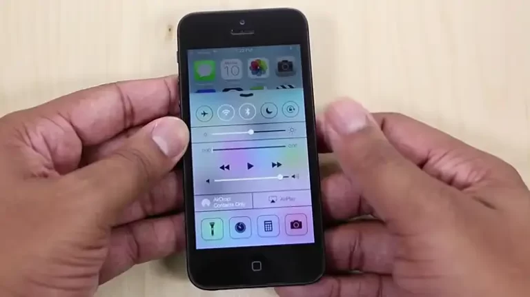
Back in 2012, a vigorous debate was unfolding about Apple’s software aesthetics. Critics argued the visual metaphors in iOS – apps resembling real objects like notepads and calculators – were outdated “skeuomorphs” in an increasingly flat, minimalist tech world.
Apple defended the designs as intuitive and familiar. However, the public controversy highlighted tensions between innovation and tradition in interface design. When Apple revealed iOS 7 with a completely revamped look, it appeared they’d purged ornamental mimicry for good.
Of course, disputes over screens and interaction models were nothing new. Debates have raged ever since the first graphical user interfaces over optimal layouts and behaviors. But the sudden furor over “skeuomorphism” connected to deeper nerves about technology’s role.
The Surprising Evolution of “Skeuomorph”
Long before exploding into Apple design debates, “skeuomorph” was an obscure word used by archaeologists and biologists. It described vestigial features that linger awkwardly after their original purpose fades – like artifacts still bearing ornamental trim or body parts that now lack function.
The term had little to do with aesthetics or interface critiques initially. But as Apple popularized visual metaphors emulating real-world objects, critics appropriated the weighty vocabulary to call out excessively ornamented imitation. Though misapplied academically, adopting the exotic term gave credibility to arguments for modernized digital aesthetics. The linguistic pivot revealed tensions around software mimicking physicality amidst massive technological disruption.
Beyond Skeuomorphs: Metaphors Embedded Everywhere
The skeuomorphism debate died down, but not the underlying dynamics it revealed. As software moves beyond screens into environments, bodies, and cities, finding the right metaphors becomes even harder yet more critical.
Voice assistants aim for personality-rich conversations but can frustrate relational expectations. AI systems copy neural biology but show the limits of imitating human cognition. Word choices like algorithm “feedback” and data “ecosystems” reveal conceptual metaphors shaping how developers think.
In truth, computing has always been metaphorically bound with analog phenomena, from files and folders to clouds and viruses. The skeuomorph fixation was too narrowly focused. Realism, imitation, and mimicry influence far more than app icons.
Why Debates Over Design Run So Deep
Pundit wars over “flat” vs. “skeuomorphic” interfaces often got simplified as aesthetic taste or generational divide. But tensions over digital appearances reflected diverging philosophies on how to best serve users in a climate of ever-advancing change.
Design choices form assumptions about people’s wants and needs – whether more options provide freedom or create unwanted complexity, for example. They require balancing intuitive recognition with sufficient progress. When new patterns significantly alter previous workflows, backlash typically emerges until familiarity settles.
This means interface design disputes run so hot because the user experience stakes feel high to so many. The companies that dismiss tensions as superficial do so at their peril. Because technology is embedded everywhere in life, design debates reveal desires for empowerment amidst disruption.
Wrapping Up
The core questions long preceded trendy tech terms and will outlive platform shifts from desktop OSs to apps to spatial computing. Finding the right physical allusions to drive adoption while pushing progress is an ongoing quest. And its outcomes help determine whether people guide technology’s growth, or vice versa.